KITE Design
- Client: KITE Design Research GmbH
- Year: 2023
- Our Roles: Concept, Design, and Code
- Services: Visual Identity, Branding, Development, Web Development, Frontend Development, Backend Development, Prototyping, Digital Design, Interaction Design, and UX/UI Design
KITE Design Research is a collective for design research. In their critical design practice, which combines design with science, they explore innovative technology developments, optimize intersections between people and technology, and analyze and challenge existing systems and processes to develop socially responsible solutions for a sustainable future.
Our work for KITE Design Research focused on the further development of their corporate design and the visual and structural renewal of their website.
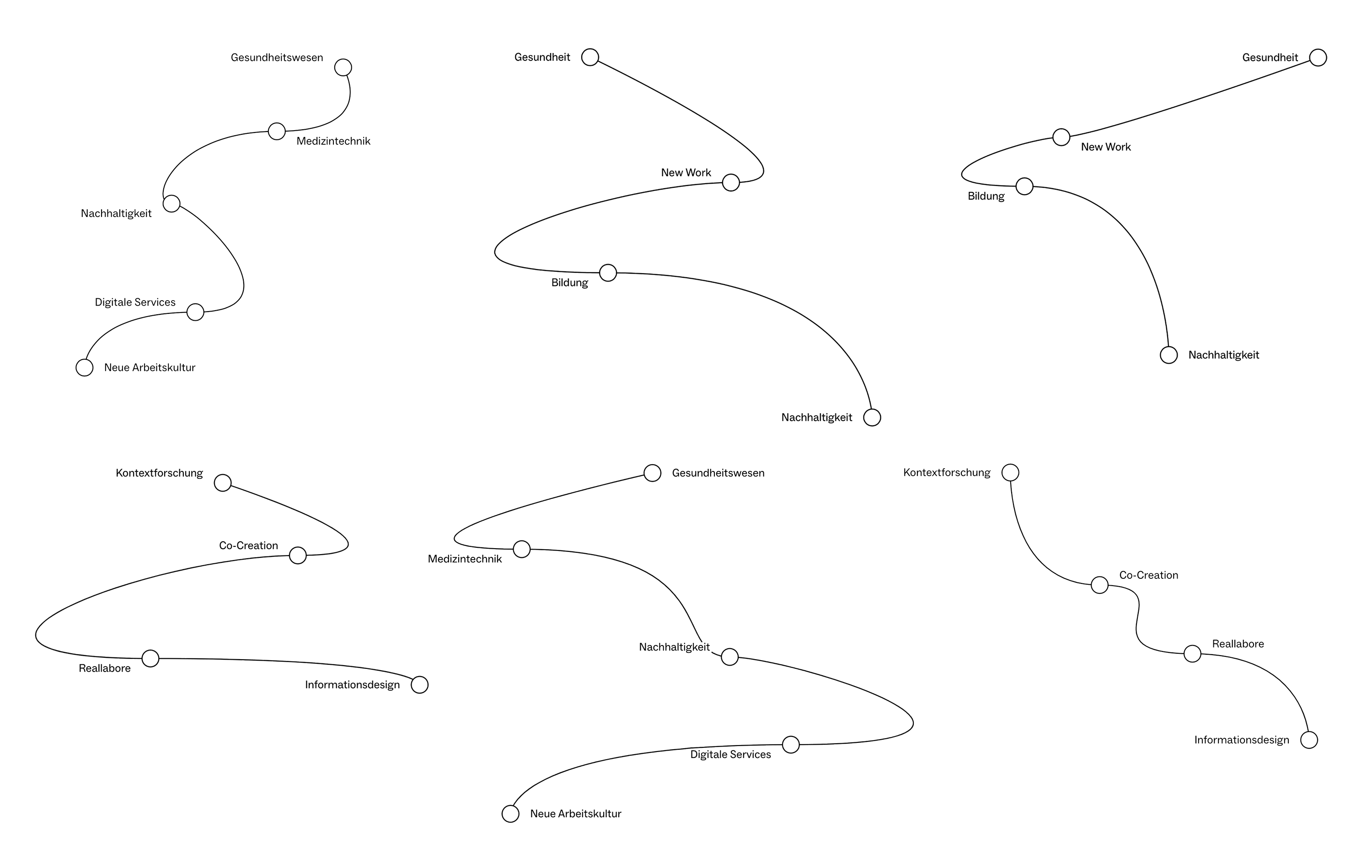
To give KITE an unique visual identity, we work with bold fonts that bring a lot of character - online, but also in print and future live talks. This results in simple yet exciting layouts that convey texts in an appealing way. Modular content blocks for large-format quotes, clear tables and media communicate a wealth of content without overwhelming or boring your eye.
Terms that not everyone understands straight away are explained in a glossary that can be used via a sidebar or as a separate subpage. This knowledge database grows with the content of the site and improves its visibility in search engines.
We use Craft CMS for easy maintenance of website content. Entries can be created in multiple languages and are modular, so they can easily be integrated in several places. This means that the website for KITE remains customizable and expandable.
The frontend works according to the Less JavaScript principle. It not only enables improved performance, but also contributes to more effective use of resources by reducing the JavaScript code. The shorter loading times have a positive effect on the user experience and therefore also on the core web vitals.

- Services: Visual Identity, Branding, Development, Web Development, Frontend Development, Backend Development, Prototyping, Digital Design, Interaction Design, and UX/UI Design
- Medium: Website